News
New look MVIS website
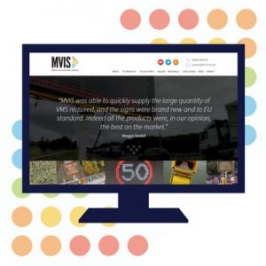
MVIS is delighted to announce we’ve completely overhauled, refreshed and updated our website to make it easier for customers and partners to get the information they need.
The old site served us well for many years but at MVIS we’re always moving forwards and it no longer reflected the high degree of innovation our products and solutions offer nor the passion for customer service on which we’ve built our business.
Designed and developed with our Marketing Partners at FIG, the new site is cleaner, bolder, easier to navigate and will get you to where you want to be in fewer clicks.
We’ve fine-tuned our logo to look more progressive and turned up the brightness across our branding. The overall website design (which has significantly less black!) now reflects the positivity and determination with which we approach every project we are involved in and our overarching strategy to help making the UK’s roads and major events run as smoothly and safely as possible.
Said FIG designer Emma Dixon:
“FIG has worked with MVIS for many years watching as it’s grown into a leading UK supplier – so we wanted the new site to do it justice. The use of bold colours, videos, intuitive navigation and the increased emphasis on the service MVIS provides, really differentiates it from its competitors.”
We really hope you’ll find our new site interesting, easier to use and more relevant to your needs.


